
Color Trends with Timeless Appeal in a world of ever-shifting aesthetics, Timeless Color Trends stand as enduring anchors. They transcend fads, gracefully evolving across decades without losing their charm. From the subtle warmth of taupe to the crisp clarity of navy, these shades are more than just colors—they’re statements of sophistication, stability, and taste.
Interior designers, fashion experts, and creative professionals continuously rely on these hues to craft spaces and wardrobes that age gracefully. While seasonal trends often make a splash and fade, Timeless Color Trends continue to inspire long-term beauty, making them essential for anyone who values lasting impact.
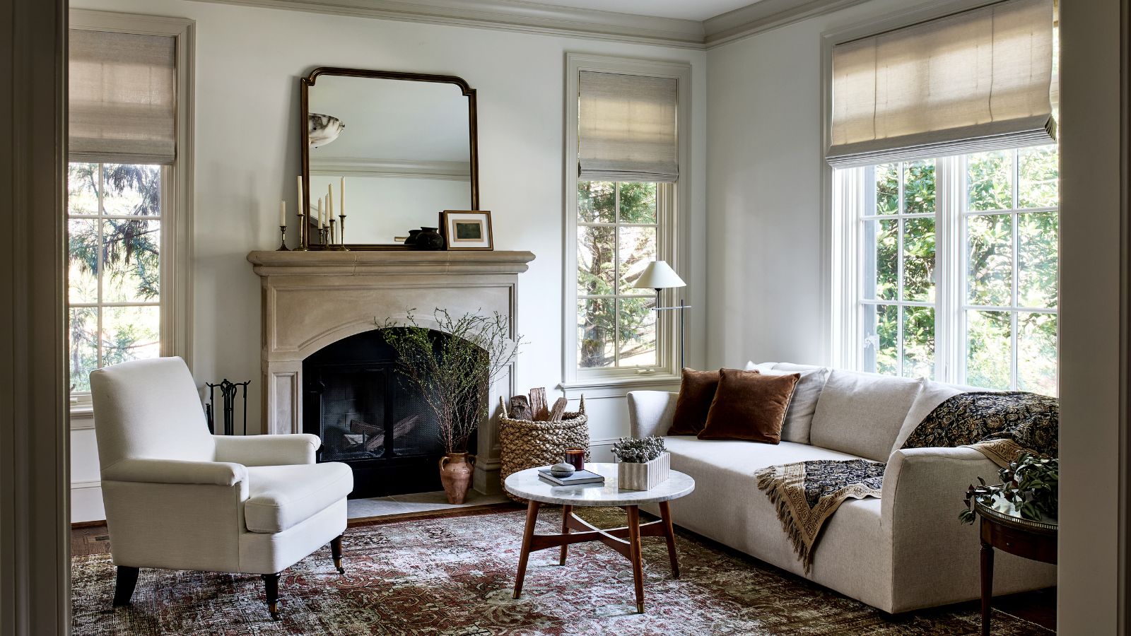
The Essence of Timelessness in Color
Color becomes timeless when it consistently evokes emotion and elegance across generations. These are shades that feel familiar yet fresh, rooted in tradition yet flexible enough to adapt.
Characteristics of Timeless Color Trends:
- Subdued rather than flashy
- Versatile across styles (modern, classic, rustic, minimalist)
- Harmonious with both natural and artificial lighting
- Evocative of nature and universal materials
Think of ivory linens, charcoal blazers, olive-toned living rooms, or deep burgundy libraries—these are images imbued with quiet power and heritage.
Top Timeless Color Trends to Incorporate
1. Navy Blue
Navy has long been a stalwart in both interiors and fashion. It’s deep, dramatic, and dependable.
Applications:
- Accent walls for moody sophistication
- Statement furniture like velvet sofas
- Classic apparel from trench coats to tailored suits
Pair with brass, cream, or white for added elegance.
2. Charcoal Gray
Not quite black, but richer than soft gray, charcoal is a neutral with gravitas. It supports bolder colors or stands alone in minimalist glory.
Best used in:
- Kitchen cabinetry
- Monochrome palettes
- Contemporary bathrooms
Its depth makes it a perennial favorite among Timeless Color Trends.
3. Forest Green
Borrowed straight from nature, this shade feels grounded and luxurious. Its deep, lush tone brings depth to any space.
Works well with:
- Leather accents
- Brass lighting
- Natural wood floors
It also has soothing psychological effects—calming the mind while invigorating the senses.
4. Taupe
This chameleon-like shade exists between beige and gray, offering flexibility in every setting. It exudes calm and maturity.
Perfect for:
- Bedroom walls
- Textiles like curtains or rugs
- Exterior siding on homes
Taupe embodies the quiet confidence that defines Timeless Color Trends.
5. Crisp White
Always elegant, never outdated. Crisp white serves as both canvas and content in design.
Used for:
- Walls in minimalist or Scandinavian interiors
- Tailored shirts or bridal gowns
- Kitchen backsplashes and tiles
It enhances natural light and amplifies space, making it a staple in refined palettes.
6. Burgundy
This deep wine tone adds drama and richness to any design. It’s romantic, warm, and unapologetically bold.
Popular in:
- Velvet upholstery
- Painted front doors
- Winter fashion collections
Despite its depth, it blends well with metallics, whites, and other deep tones.
Why Timeless Colors Matter More Than Ever
In an age of fast fashion and fleeting trends, the demand for longevity has grown. Consumers crave authenticity and sustainability. Timeless Color Trends align perfectly with this mindset.
Key advantages:
- Reduce the need for frequent redesigns
- Offer emotional consistency and comfort
- Are investment-friendly choices in both interiors and wardrobes
They also align with eco-conscious living. When color palettes stay relevant, less waste is generated.
The Emotional Impact of Timeless Colors
Each of these hues carries emotional resonance:
- Navy: stability, trust, intellect
- Taupe: balance, warmth, security
- Green: growth, harmony, freshness
- Burgundy: passion, sophistication, tradition
Incorporating Timeless Color Trends isn’t just about looks—it’s about creating spaces that feel good, day after day.
Pairing Timeless with Trendy
Timeless doesn’t mean boring. It’s entirely possible to mix perennial shades with bold, contemporary accents.
Examples:
- A navy sofa with coral cushions
- Charcoal kitchen cabinets with rose gold hardware
- Forest green walls paired with a pop of chartreuse art
This fusion allows for personal expression while keeping the core aesthetic grounded.
Timeless Color Trends in Fashion
Wardrobes built on timeless colors are versatile and enduring. Consider a capsule wardrobe:
- White blouse
- Navy blazer
- Charcoal trousers
- Taupe trench coat
These pieces transcend seasons and trends. When paired thoughtfully, they create endless combinations that always look polished.
Applying Timeless Colors in Different Spaces
Living Room
Create a serene yet stylish atmosphere with taupe walls, a forest green velvet sofa, and crisp white curtains.
Kitchen
Use navy for cabinetry, white subway tiles, and brass fixtures. Add a charcoal island for contrast.
Bedroom
Opt for burgundy accents—pillows, rugs, or wall art—against a backdrop of ivory or gray. Add textures like linen or leather.
Bathroom
Charcoal tiles with white grout. Pair with wooden accessories and sage towels for a spa-like ambiance.
Each room gains identity and depth with the strategic use of Timeless Color Trends.
Art and Accessories
Art is a great way to incorporate timeless tones. Think minimalist black-and-white photography, abstract navy paintings, or classic botanical prints.
Accessories like throw pillows, ceramics, and vases in taupe or burgundy add subtle sophistication.
Lighting and Timeless Colors
Lighting enhances or dulls the effect of your chosen palette.
- Use warm lighting for taupe and burgundy
- Cool lighting for charcoal and forest green
- Natural light enhances all Timeless Color Trends, revealing their full nuance
Layer lighting (ambient, task, accent) for maximum effect.
Floor to Ceiling Cohesion
Color cohesion from floor to ceiling matters.
- Use rugs that pick up wall tones
- Select flooring materials that contrast or harmonize with walls
- Ceilings in crisp white or soft taupe make rooms feel expansive
These details complete the visual flow and elevate your space.
The Role of Texture
Texture amplifies the depth of color. Linen, velvet, matte paint, and brushed metal all play differently with light.
Pair colors like this:
- Forest green + suede
- Burgundy + velvet
- Navy + high-gloss enamel
This adds sensory interest and prevents monochromatic palettes from feeling flat.
Timeless Color Trends Across Cultures
Many of these hues carry global significance:
- Navy in Japanese indigo dyeing
- White in Scandinavian and Mediterranean design
- Burgundy in regal Indian textiles
Timeless Color Trends often emerge from centuries-old cultural practices, making them rich with meaning and story.
Future-Proofing Your Color Palette
To ensure your palette stands the test of time:
- Limit your use of super-saturated colors
- Choose one or two timeless hues as your base
- Add personality with small-scale trendy elements
This strategy keeps your spaces dynamic without becoming dated.
Psychological Safety in Color
People gravitate toward environments that feel familiar and stable. Timeless hues contribute to this by reinforcing emotional safety and continuity.
In times of change, returning to spaces with navy walls or crisp white kitchens can offer comfort and grounding.
Final Thoughts: Beauty That Lasts
Incorporating Timeless Color Trends is about choosing quality over quantity, calm over chaos, and permanence over passing style. These shades tell a story not only of taste but also of intentional living.
They serve as the elegant backdrop for evolving lives, shifting seasons, and personal growth. Whether you’re decorating a home or curating a wardrobe, investing in timeless color is always a wise, beautiful decision.
Let these hues guide you to a future where elegance never fades and style is measured in years—not weeks.

More Stories
Step Into the Future: Bold and Beautiful Paint Trends Redefining 2024
The Alchemy of Hues: Painting Your Space with Emotional Intelligence
Whispers of the Seasons: How to Embrace Nature’s Ever-Changing Palette