
Color Trends That Mix and Match in design, contrast and harmony dance together in vibrant tandem. The art of pairing disparate hues when executed thoughtfully breeds visual intrigue and boundless creativity. Welcome to the realm of Mix Match Colors: palettes that defy convention, celebrate collision, and craft spaces pulsing with personality.
These trends show that color isn’t a solo act. When combined in unexpected ways, shades can elevate one another, ignite dialogue, and transform the mundane into the magical.
The Philosophy Behind Mixing and Matching
At its core, mixing and matching colors is an exercise in balance. Too much contrast and chaos reigns; too little, and spaces flatten into sameness. Mix Match Colors are all about achieving chromatic equilibrium, tapping into the power of complementary, analogous, and triadic schemes.
Designers use advanced color theory—considering hue, saturation, brightness, and undertone—to orchestrate palettes that surprise and delight.
1. Complementary Contrasts
Opposites attract. Complementary pairs—colors directly across the color wheel—produce high-impact statements. Think fiery red against verdant green, or sapphire blue paired with tangerine.
- Applications: Accent walls juxtaposed with furniture.
- Case Study: A living room with emerald sofas and terracotta feature walls.
- Why It Works: The visual tension drives energy and focus.
2. Analogous Harmony
Neighboring hues on the wheel—such as teal, aqua, and mint—create serene progressions. This Mix Match Colors strategy fosters subtle transitions.
- Applications: Gradient ombré effects on walls or textiles.
- Case Study: An ombré shower tile running from seafoam to deep ocean.
- Why It Works: Provides cohesion while maintaining color interest.
3. Triadic Tones
Triadic schemes select three colors evenly spaced around the wheel—like violet, orange, and green. The result is vivid and balanced.
- Applications: Bold graphic patterns, throw pillow clusters, eclectic art.
- Case Study: A dining room mixing mustard chairs, teal cabinetry, and lavender drapes.
- Why It Works: Offers visual richness without overwhelming.
4. Split-Complementary Schemes
A nuance on complementary; choose a base color and the two adjacent to its complement. This softens the stark resistance of pure opposites.
- Applications: Kitchen islands offset by bar stools and backsplash.
- Case Study: Blush pink island, paired with muted olive stools and slate gray accents.
- Why It Works: Less jarring yet still dynamic.
5. Neutral Pairing with Vibrant Pops
Ground intense hues in neutral surroundings. Chalky whites, greige, and stone grays anchor flashes of neon or jewel tones.
- Applications: White walls with neon lampshades or sapphire art pieces.
- Case Study: Scandinavian living room with white-washed walls and burnt orange accent chair.
- Why It Works: Maintains calm while allowing focal points to shine.
6. Warm and Cool Juxtaposition
Mixing temperature-based palettes—warm corals with cool blues—creates invigorating interplay.
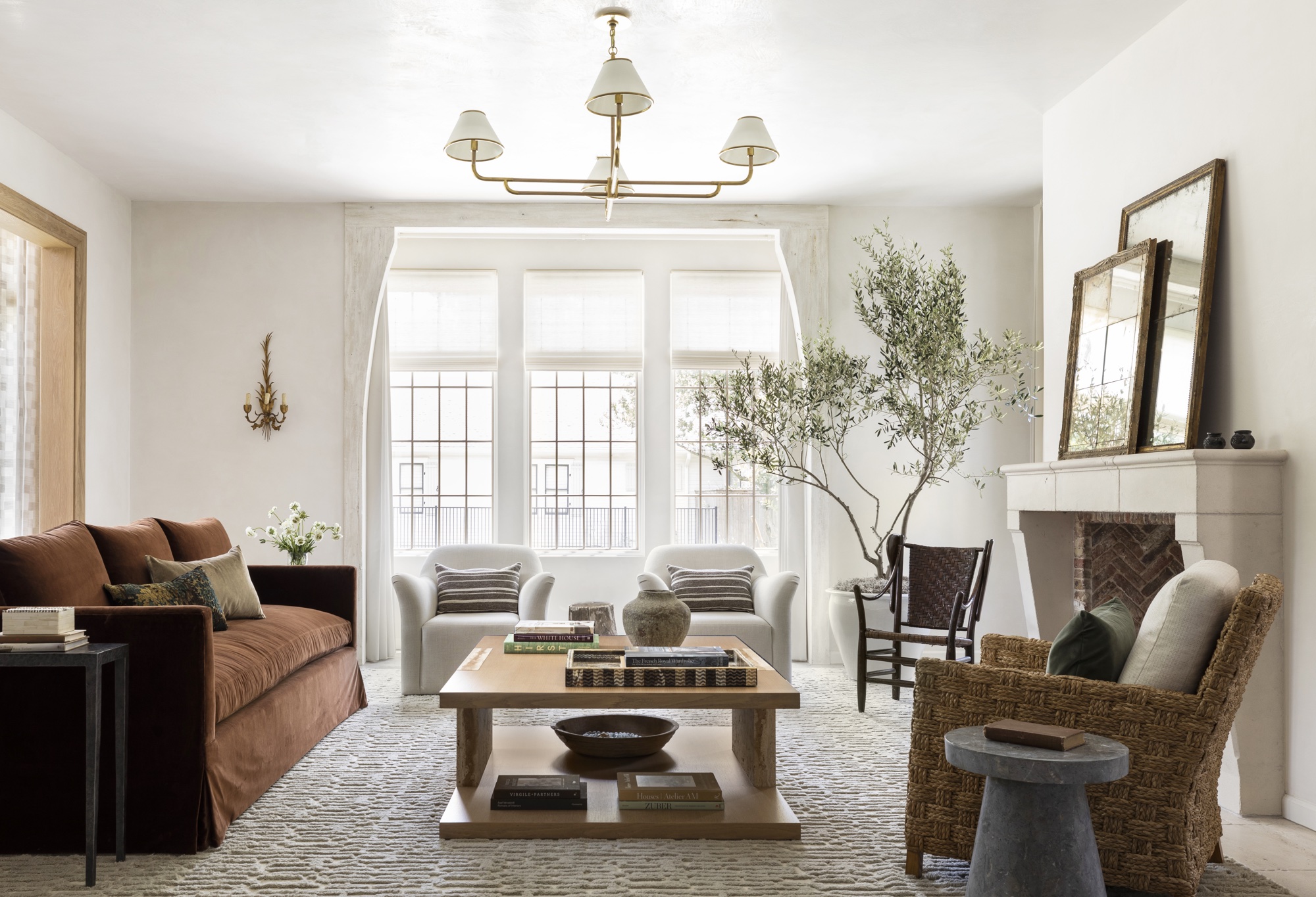
- Applications: Living spaces blending rust sofas with indigo cushions.
- Case Study: Outdoor patio combining terracotta tiles and turquoise furniture.
- Why It Works: Stimulates both the senses and the psyche.
7. Monochrome Meets Accent
Start with a monochromatic canvas—layers of gray or taupe—then introduce one vivid accent.
- Applications: All-beige living area punctuated by a single emerald sofa.
- Case Study: Minimalist office in slate gray with a mustard yellow desk lamp.
- Why It Works: Keeps overall design cohesive while focusing attention.
8. Pattern Play with Color
Combine patterns—stripes, florals, geometrics—using a limited palette of Mix Match Colors. This method yields complexity without chaos.
- Applications: Mix striped rugs with botanical pillows in the same hue family.
- Case Study: Bedroom blending a navy and paper-white stripe duvet with floral curtains in sapphire and blush.
- Why It Works: Pattern anchors color combinations, creating unity.
9. Metallic Infusion
Overlay metallics—brass, rose gold, gunmetal—onto mixed palettes to unify and elevate.
- Applications: Picture frames, light fixtures, cabinet handles.
- Case Study: Emerald green kitchen cabinets with brass hardware and a gold-veined marble countertop.
- Why It Works: Metallics bridge disparate colors by reflecting ambient hues.
10. Unexpected Color Pair Cosplay
Bold trend: pairing colors historically deemed clashy—like chartreuse with fuchsia or teal with marigold.
- Applications: Statement furniture pieces, avant-garde murals.
- Case Study: Modern café painted in lime green and bubblegum pink stripes.
- Why It Works: Contrarian choices can become signature statements when balanced by scale and restraint.
Tips for Mastering Mix Match Colors
- Swatch Testing: Compile large-scale samples to observe interactions under various lights.
- Rule of Three: Limit primary hues to three per space for manageability.
- Texture Layering: Different finishes—matte, satin, gloss—alter perception.
- Balance Saturation: Pair a vivid tone with softer versions to avoid overload.
- Anchor with Neutral: Ensure at least one neutral ties everything together.
Psychological Impact of Mixed Palettes
Diverse color pairings can energize, soothe, or stimulate reflection. Complementary contrasts raise alertness; analogous sequences calm the mind. Consider your desired emotional outcome when choosing Mix Match Colors.
Where to Spot These Trends
- High-End Hospitality: Boutique hotels designing immersive color stories.
- Contemporary Art Spaces: Galleries employing color blocking to enhance exhibits.
- Urban Residences: Trendy lofts mixing industrial tones with vibrant accents.
Future Directions in Color Fusion
Emerging technologies—like AI-driven color forecasting—are honing palettes. Expect to see:
- Responsive hues that shift with lighting conditions.
- Eco-dyes in unconventional color combinations.
- Cross-cultural fusion palettes melding indigenous and digital age tones.
The future of Mix Match Colors is as limitless as imagination itself.



More Stories
Transform Your Home with These Unexpected Decor Hacks
Creative Home Decor: Transforming Spaces with Style and Substance
Sunlit Serenity: 15 Transformative Decor Ideas to Elevate Your Space with Warmth and Whimsy