
Color Trends That Pop on Walls walls are more than just architectural boundaries—they’re canvases of self-expression. In 2025, bold interior statements are gaining momentum as designers and homeowners alike seek to inject personality into their living spaces. The new wave of Wall Popping Colors is all about going beyond beige, embracing dynamic hues that stimulate the senses and awaken emotion.
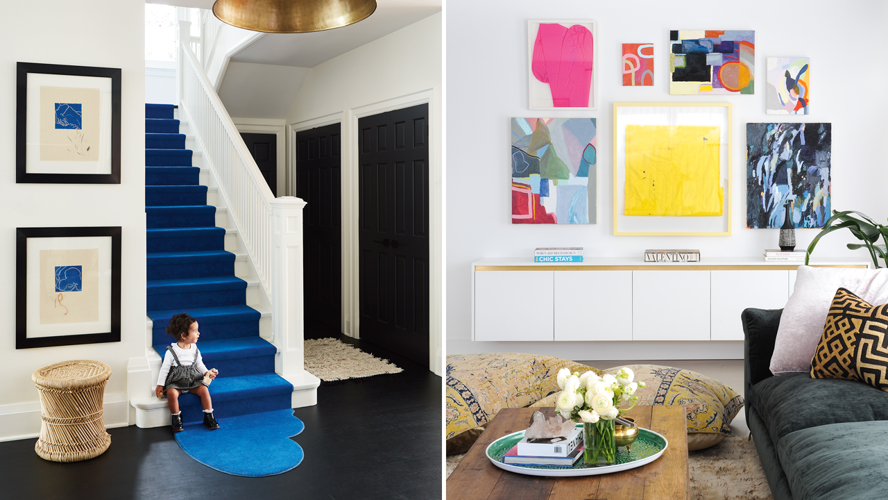
The Rise of Expressive Interiors
Minimalist white has had its moment. Now, walls are being treated as storytelling tools. From moody teals to electric corals, color is being used to evoke narrative, mood, and meaning. Wall Popping Colors have become synonymous with courage in design. They break the rules of “safe decorating” and welcome individuality in every brushstroke.
What Are Wall Popping Colors?
The term Wall Popping Colors refers to hues that make an instant impact. These are colors with personality, ranging from saturated jewel tones to intense earth-inspired shades. They defy neutrality. They command attention.
Examples include:
- Firecracker red
- Ultramarine blue
- Electric mustard
- Jungle green
- Burnt orange
- Bubblegum pink
These shades are unapologetically bold and incredibly versatile when used correctly.
Why They Work
Color psychology plays a huge role in the popularity of Wall Popping Colors. Bold hues stimulate emotion. Red raises energy. Yellow fosters optimism. Blue soothes the mind while still delivering a powerful visual. These shades create a visceral connection, making rooms unforgettable.
Additionally, with the rise of remote work, people are craving spaces that inspire. Energizing walls help maintain focus, spark creativity, and offer mood enhancement—a direct response to bland work-from-home backdrops.
Key Wall Popping Color Trends for 2025
1. Cerulean Storm
A hybrid of oceanic blue and stormy gray, cerulean storm is elegant, grounding, and unexpectedly dramatic. It pairs beautifully with natural wood and metallics.
Use it in:
- Home offices for focus
- Bathrooms for spa-like serenity
2. Spiced Paprika
This rich red-orange hue exudes warmth and adventure. Spiced paprika thrives in eclectic or bohemian-inspired spaces.
Perfect for:
- Dining rooms
- Feature walls in cozy nooks
3. Neon Clay
Think terracotta, but electrified. Neon clay offers the earthy foundation of a clay tone, amplified with a bright, neon finish.
Try it in:
- Modern kitchens
- Accent walls in minimalist rooms
4. Aloe Glow
A luminous green that mimics fresh aloe, this shade breathes life into sterile rooms. Aloe glow is refreshing and youthful.
Use it for:
- Nurseries
- Creative studios
5. Royal Orchid
Deep, luxurious purple with hints of berry and midnight blue, royal orchid adds drama and decadence to any setting.
Best for:
- Bedrooms
- Library walls
How to Style Wall Popping Colors
To balance bold hues, pairing is essential. Complementary neutrals such as sand, slate, or ivory can ground these colors and allow them to shine.
Tips:
- Use matte finishes for softer visual texture.
- Pair with minimalist furniture to avoid visual overload.
- Introduce natural materials (wood, rattan, linen) to temper intensity.
Don’t be afraid to mix patterns and textures. Bold walls create the perfect backdrop for daring decor.
Accent Walls vs. Full Immersion
Wall Popping Colors don’t have to cover all four walls to make a statement. Accent walls are a popular entry point for experimenting with bold shades.
Benefits of accent walls:
- Easy to update later
- Provide focal point
- Offer color without commitment
For a more immersive look, fully painted rooms can envelop occupants in an emotive experience.
Artistic Techniques
2025 embraces creative paint techniques alongside bold colors. Think ombré walls, two-tone diagonal cuts, geometric color blocking, or brushstroke murals. These artistic applications enhance the effect of Wall Popping Colors, turning your home into a gallery space.
Lighting Considerations
Lighting dramatically impacts how wall colors are perceived. A bright red might feel invigorating in daylight but overwhelming under warm bulbs. Always test swatches in various lighting conditions before committing.
Lighting tips:
- North-facing rooms benefit from warmer tones
- South-facing rooms can handle cooler, deeper shades
- Use dimmers to change the room’s mood throughout the day
Materials That Enhance Bold Color Walls
Texture can make Wall Popping Colors feel even more impactful. Try using textured plaster, limewash, or Venetian stucco for added depth.
Great material pairings:
- Velvet curtains in contrast colors
- Brass or copper fixtures
- Polished concrete floors
These materials add sophistication and keep the room feeling balanced.
Small Spaces, Big Statements
Don’t shy away from using Wall Popping Colors in compact areas. Powder rooms, entryways, and alcoves are ideal for experimentation.
Bold colors can actually make small rooms feel more curated and intentional—transforming overlooked areas into design moments.
Custom Murals and Personalized Patterns
Consider going beyond single shades by commissioning a custom mural or using wallpaper that incorporates Wall Popping Colors. Personal motifs, abstract shapes, or nature-inspired imagery can elevate a space instantly.
This adds narrative and uniqueness to a room, reflecting your personality while keeping things visually stimulating.
Combining Bold Walls with Art
A common question: Can bold walls coexist with art? Absolutely. In fact, art can be more impactful against a vibrant backdrop.
Tips:
- Use white or black frames to create contrast
- Opt for minimalist art on extremely bright walls
- Choose artwork with complementary or analogous colors
Let the color and the art have a conversation—not a competition.
Color Blocking in Open Layouts
Open-concept homes benefit from Wall Popping Colors when used strategically for zoning. Use color to distinguish dining, living, and kitchen spaces without walls.
Tactics:
- Paint ceiling beams or soffits
- Use color on partial walls or columns
- Employ paint “rugs” by outlining floor zones with ceiling-to-floor stripes
Eco-Friendly Paint Options
With rising eco-consciousness, sustainable paints are in high demand. Look for low-VOC and non-toxic options that still deliver vibrant Wall Popping Colors.
Recommended brands:
- Clare
- ECOS Paints
- Farrow & Ball (Eco formula lines)
These allow you to make bold statements without harming indoor air quality.
Global Influence on Wall Color Trends
International design is shaping 2025’s color palettes. Japanese wabi-sabi, Moroccan maximalism, and Scandinavian contrasts all influence today’s Wall Popping Colors.
Examples:
- Moroccan spice red
- Scandinavian midnight blue
- Japanese indigo and wasabi green
Travel, culture, and heritage continue to be rich sources of pigment inspiration.
Future-Proofing Bold Choices
Concerned that your favorite bright color may become outdated? Fear not. Design is cyclical. To future-proof your space:
- Choose classic bolds (e.g., navy, emerald, burgundy)
- Keep furniture neutral so the wall color remains the star
- Use color in art and accessories that can be easily changed
This approach allows flexibility and longevity.
Final Thoughts: Dare to Be Daring
Color transforms. Wall Popping Colors allow walls to be more than background—they become protagonists in your home’s visual narrative. When selected with intention and styled with care, these hues ignite creativity, confidence, and emotional resonance.
So take the leap. Swap that greige for jungle green. Trade off-white for papaya blush. Paint your world with color that thrills.
Because life is too vivid to be lived in beige.


More Stories
Step Into the Future: Bold and Beautiful Paint Trends Redefining 2024
The Alchemy of Hues: Painting Your Space with Emotional Intelligence
Whispers of the Seasons: How to Embrace Nature’s Ever-Changing Palette