
Color Trends That Play with Light in contemporary interior design, color and light engage in an intricate dance, transforming mundane walls into dynamic canvases that shift and shimmer throughout the day. Harnessing Light Play Colors is akin to wielding a painter’s brush that responds to its surroundings, revealing new facets as sunlight filters through windows or artificial fixtures glow after dusk. These hues not only imbue spaces with visual intrigue but also elevate the sensory experience, making rooms feel expansive, intimate, or even ethereal.
From pearlescent finishes that ripple under ambient rays to chameleon-like pigments that warp with each angle, the latest color trends embrace luminosity as a design element in its own right. In this comprehensive guide, you’ll discover principles of light-responsive chromatics, explore the most compelling palettes and finishes, and learn practical strategies for integrating Light Play Colors into every corner of your home or workspace.
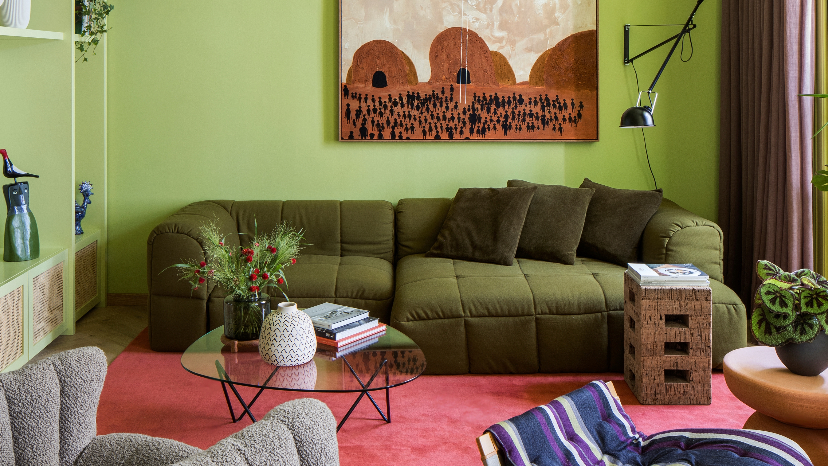
The Interplay of Light and Hue
Light is the catalyst that activates color. Without illumination, every pigment lies dormant; with the proper luminosity, those pigments reveal their full potential.
- Spectral Interaction: Natural sunlight contains the full spectrum of visible wavelengths, coaxing paints and finishes to display their richest tones. North-facing rooms, offering cooler daylight, emphasize blues and greens, whereas south-facing spaces intensify warm reds and oranges.
- Angle of Incidence: A hue’s appearance changes depending on the angle at which light strikes. Metallic and iridescent paints are particularly sensitive to this, offering prismatic reflections that shift as you move around the room.
- Artificial Light Sources: LED, incandescent, and fluorescent bulbs each emit different color temperatures. Warm white bulbs (2700K–3000K) soften bold pigments, while cool white (4000K–5000K) can sharpen contrasts and highlight undertones.
Understanding how light interacts with pigment is the first step toward curating a space that truly plays with luminosity.
Trending Light-Responsive Palettes
Designers are gravitating toward palettes that adapt to fluctuating light conditions, offering versatility and surprise.
- Pearl Whisper: Soft whites with a whisper of iridescence. Under daylight, these shades appear as creamy neutrals; as night falls, they adopt a pearlescent glow that feels almost lunar.
- Prismatic Coral: A base of gentle coral overlaid with fine micro-glass flecks. The resulting effect is an aqueous shimmer reminiscent of sun-dappled tide pools.
- Luminous Slate: A slate gray imbued with metallic silver undertones. In low light, it reads as a moody charcoal; in bright light, it gleams with silvery accents.
- Opalescent Orchid: A lavender-infused hue with subtle color-shifting pigments. Depending on light, it oscillates between purple, pink, and faint mint green.
Each of these palettes responds uniquely to environmental lighting, ensuring rooms never feel static.
Reflective Finishes and Sheens
The finish you choose can magnify—or mute—the effects of Light Play Colors.
- Gloss and Semi-Gloss: These high-sheen options reflect ambient light, amplifying brightness and making spaces feel larger. They’re ideal for accent walls or cabinetry but may highlight surface imperfections.
- Pearlescent: Incorporate mica or synthetic mica-alternative pigments to create a soft, iridescent finish. This finish maintains a delicate sheen without the stark reflection of gloss.
- Metallic and Sparkle: Fine metallic powders or glitter additives offer concentrated points of reflection. When used judiciously—perhaps on a ceiling or niche—these finishes create a celestial ambiance.
- Satin: A compromise between matte and gloss, satin finishes provide gentle reflectivity, balancing luminosity and concealment.
By selecting finishes that complement your chosen pigments, you can orchestrate a symphony of light and texture.
Gradient and Prismatic Effects
Moving beyond solid fields of color, gradients and prismatic applications elevate walls into shifting landscapes.
- Ombré Walls: Transitioning from light to dark or vice versa, ombré effects imbue depth and movement. Pair with minimalist furnishings to let the gradient remain the star.
- Chroma-Shift Paints: These specialized coatings contain pigments that alter hue based on viewing angle. A single wall can appear blue from one vantage and magenta from another.
- Spectrum Murals: Hand-painted or stenciled murals that mimic the refracted fragments of a prism. Integrate transitional bands of Light Play Colors for a bespoke focal point.
Creating smooth gradients requires meticulous technique—airbrushing or multiple thin coat applications—to avoid harsh demarcations.
Strategic Lighting Techniques
To maximize Light Play Colors, lighting must be as intentional as paint selection.
- Directional Spotlights: Aim narrow beams at key walls to enhance metallic or pearlescent finishes. The focused illumination accentuates micro-textures, creating living tapestries of light.
- Concealed LED Strips: Installed in coves or behind moldings, LED strips bathe walls in diffuse, even light. Choose tunable white strips to adjust color temperature throughout the day.
- Floor Uplights: Ground-mounted fixtures project upward, adding drama and emphasizing vertical surfaces. They work exceptionally well with chameleon pigments that reveal new shades at changing light angles.
- Dimmers and Smart Controls: The ability to modulate brightness and warmth is crucial. By dialing in different settings, you can orchestrate varied ambiences—energizing at midday, cozy at twilight.
Lighting is not merely functional; it’s your partner in unveiling the full spectrum of Light Play Colors.
Color and Shadow Play
Color exists in tandem with shadow; the interplay defines spatial perception.
- Deep Recesses: Painting recesses or alcoves in darker shades adds depth. When illuminated, these pockets recede visually, creating a layered effect.
- Shadow Accents: Utilize protruding moldings or textured finishes to cast intentional shadows. The resulting chiaroscuro highlights the dynamic relationship between light and pigment.
- Contrasting Shadows: Pair high-sheen adjacent to matte areas. The glossy surface reflects light boldly, while the matte region absorbs it, sharpening contrast.
Through strategic use of shadow, color becomes an active participant in the drama of space.
Textured Surfaces
Texture amplifies the effects of Light Play Colors, offering tactile and visual depth.
- Venetian Plaster: This polished plaster finish catches light at varying angles, creating subtle undulations of tone.
- Textured Wallpaper: Choose wallpapers with metallic threads or raised patterns. They reflect and diffuse light across their surface relief.
- 3D Panels: Architectural wall panels with relief geometries play with both shadow and reflection, transforming static walls into sculptural backdrops.
When combining texture and light-responsive pigments, start with a focal wall and expand outward once you’re satisfied with the effect.
Seasonal Light Considerations
Just as the sun’s trajectory changes, so does the quality of ambient light.
- Winter Illumination: Shorter days and overcast skies favor warmer bulbs (2700K–3000K) to enhance coziness. Opt for Light Play Colors with warmer undertones to offset the bluish natural light.
- Summer Brilliance: Longer daylight hours call for cooler bulbs (4000K–5000K) that balance bright sunlight. Select pigments with higher reflectance values to avoid glare.
- Transitional Equinoxes: During spring and autumn, mix tunable LEDs to match shifting natural color temperatures throughout the day.
Anticipating seasonal light shifts ensures your Light Play Colors remain harmonious year-round.
Integrating into Different Spaces
Every room demands a tailored approach when showcasing Light Play Colors.
- Living Areas: Accent walls with prismatic paints enliven communal spaces. Pair with neutral furnishings to prevent visual overload.
- Kitchens: Metallic backsplashes or cabinetry infused with micro-glimmer pigments add functionality and flair. The reflective surfaces also enhance task lighting.
- Bedrooms: Soothing gradients of pearlescent pastels foster relaxation. Diffuse bedside sconces further soften transitions between colors.
- Bathrooms: High-humidity environments benefit from glazed ceramic tiles or waterproof metallic paints. Highlight niches or showers to capitalize on liquid reflections.
Assess each space’s unique requirements—traffic, humidity, scale—and adapt your color and finish combinations accordingly.
Maintenance and Longevity
Lucent finishes necessitate proper care to retain their luster.
- High-Quality Formulations: Invest in professional-grade, low-VOC paints with UV-resistant pigments. This prevents fading or chalking under prolonged sunlight exposure.
- Gentle Cleaning: Use microfiber cloths and pH-neutral cleaners for glossy and pearlized walls. Avoid abrasive sponges that can scratch reflective surfaces.
- Periodic Inspection: Metallic and pearlescent finishes may develop micro-cracks over time. Inspect annually and touch up with compatible paint to maintain uniformity.
A proactive maintenance plan safeguards the dynamic brilliance of your Light Play Colors.
Color is no longer static; with Light Play Colors, it becomes an ever-evolving phenomenon. By mastering the relationship between pigment, finish, and illumination, you can craft spaces that surprise and delight at every glance. From gradient walls that mimic the sky’s transitions to metallic sheens that shimmer like starlight, the possibilities are boundless.
Embrace experimentation: sample small areas, adjust lighting schemes, and let the interplay of light and hue guide your design journey. In doing so, you’ll not only elevate your interiors but also cultivate environments that resonate with vitality, depth, and a palpable sense of wonder.
Light your world—let color respond, react, and radiate with every beam. Your home, your canvas, and Light Play Colors as your medium.



More Stories
Step Into the Future: Bold and Beautiful Paint Trends Redefining 2024
The Alchemy of Hues: Painting Your Space with Emotional Intelligence
Whispers of the Seasons: How to Embrace Nature’s Ever-Changing Palette