
Color Trends That Keep You Inspired in a world where visual storytelling defines lifestyle and design, color emerges as a transformative force. Whether you’re styling your home, wardrobe, or digital palette, certain hues consistently uplift, energize, and creatively recharge. These are the Inspired Color Trends not just fleeting favorites but palettes that awaken your artistic side and fuel day-to-day vibrancy.
Why Color Fuels Creativity
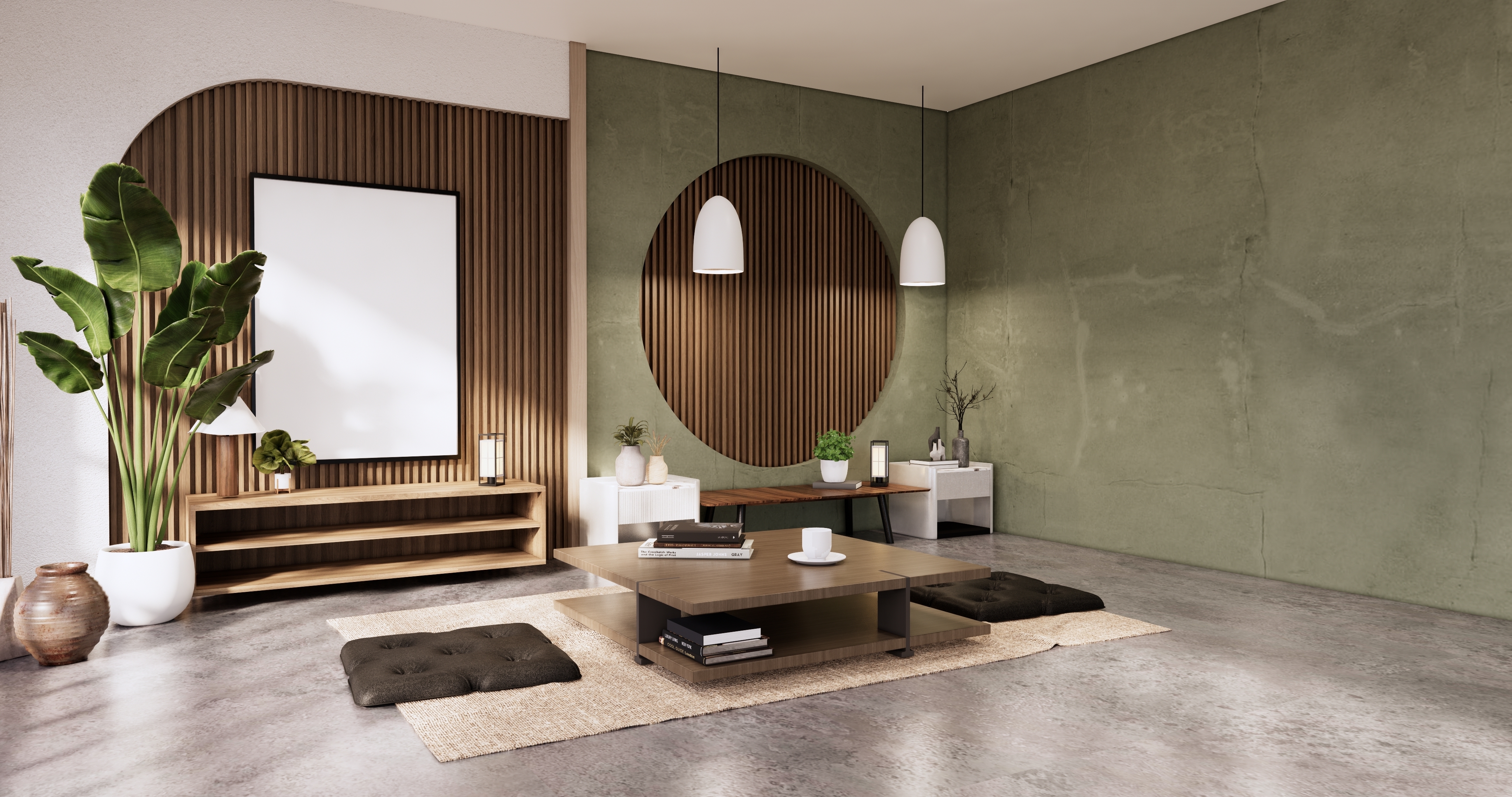
Color isn’t merely decorative. It plays a psychological role in how we feel, think, and create. Bright yellows stimulate optimism. Earthy tones ground us. Cool blues and greens help us focus. By curating intentional palettes, designers are tapping into emotional cues that turn everyday spaces into hubs of inspiration.
The Rise of Mindful Design Palettes
Post-pandemic aesthetics have embraced mindfulness. People crave serenity, balance, and purpose in their surroundings. The result? A pivot toward Inspired Color Trends that blend mood-boosting shades with a refined, organic edge. Think calming mauves paired with energizing apricots. Dusty sages against ivory whites. Or bold mustards softened by blush pinks.
1. Coral & Sandstone: Energetic Meets Grounded
This color duo is like a morning walk on a warm beach. Coral adds vibrancy, while sandstone offers a natural neutral base. It’s a favorite in lifestyle photography, resort-style interiors, and fashion.
- Best for: Entryways, mood boards, throw pillows
- Style match: Coastal boho, minimalist Mediterranean
2. Cobalt & Terracotta: Creative and Confident
This unexpected blend pairs the richness of terracotta with the electricity of cobalt blue. Together, they evoke art galleries, creative studios, and bold branding concepts.
- Best for: Home offices, accent walls, digital branding
- Style match: Eclectic, modernist, artisan-inspired
3. Dusty Lilac & Sage Green: Subtle but Soulful
If tranquility had a palette, this would be it. These soft hues exude calm and introspection, perfect for spaces where peace and productivity are paramount.
- Best for: Reading corners, bedrooms, therapy offices
- Style match: Scandinavian, Japandi, earth-toned minimalism
4. Tangerine & Powder Blue: Nostalgic yet Fresh
A retro throwback with a fresh twist. Tangerine, reminiscent of 70s pop art, meets powder blue—a hue that channels innocence and nostalgia.
- Best for: Retro-inspired branding, creative lounges, kids’ spaces
- Style match: Mid-century modern, playful contemporary
5. Forest Green & Clay Pink: Nature Refined
This combo channels the outdoors—lush greenery and warm minerals. It’s both rustic and polished, and often seen in sustainable design projects.
- Best for: Eco-inspired kitchens, curated product lines, boutique interiors
- Style match: Modern farmhouse, organic luxury
How Designers Apply Inspired Color Trends
Designers are no longer chasing trends blindly. They’re looking for story-driven hues that anchor a visual experience. Many begin with a hero color, then layer accent shades based on lighting, texture, and functionality. For example:
- Hero hue: Rich navy
- Accent: Blush pink
- Supporting neutral: Taupe or soft cream
This thoughtful layering allows for longevity and emotional depth in color design.
The Psychology of Staying Inspired
A key trait of Inspired Color Trends is their ability to evolve with mood and meaning. These are not loud, fleeting shades. Instead, they are nuanced tones that remain relevant through changing seasons and emotional states. They help reduce decision fatigue and increase visual harmony.
- Uplifting shades: Coral, yellow ochre, seafoam
- Grounding hues: Walnut brown, sage, charcoal
- Creative stimulants: Cyan, orchid, scarlet
From Digital to Physical: Transcending Mediums
These trends aren’t just for interior walls. They’re crossing over into UI/UX design, packaging, fashion, and even wellness branding. A soothing lavender might show up in meditation apps. A cheerful citron yellow in vitamin bottle labels. Consistency across physical and digital platforms keeps the inspiration loop continuous.
Cultural Impact on Color Trends
Color is inherently cultural. What inspires in Tokyo may feel muted in Marrakech. Global design hubs are seeing a convergence:
- Nordic regions: Soft pastels and light-infused neutrals
- Latin America: Saturated reds, yellows, and tropical greens
- Middle East: Jewel tones like turquoise, ruby, and saffron
Inspired Color Trends borrow freely across borders, resulting in globally relevant yet locally resonant palettes.
Textures That Complement Inspiring Colors
Color never works in isolation. Texture enhances its depth. Velvet deepens plum. Linen softens sage. Ceramic glazes electrify cobalt. Layering these tactile elements makes the color story more dynamic.
Suggestions:
- Use matte finishes for calming tones
- Add gloss to amplify brightness
- Mix natural fibers to balance high-chroma colors
Year-Round Inspiration Palettes
Some colors shine brightest in specific seasons. But others hold their charm year-round. That’s the beauty of Inspired Color Trends—they transcend fleeting moments.
- Spring/Summer: Peach, mint, crisp white
- Fall/Winter: Merlot, navy, cinnamon
- All-season: Clay, mauve, charcoal, ochre
Inspirational Color Trends in the Wild
- Pinterest Boards: Home décor lovers pinning cozy peach walls with sage sofas
- Instagram Reels: Makeup artists using tangerine and blush blends
- Boutique Hotels: Interiors washed in deep teal and sand-toned wood
- Wellness Brands: Skincare in sea-glass greens and sandy beige
These spaces don’t just look good—they feel uplifting, aspirational, and artful.
Practical Tips to Incorporate Inspired Color Trends
- Start with one item: a chair, lamp, or piece of art
- Build around a feeling: calm, energetic, grounded
- Use apps to test how colors interact in your space
- Observe how light changes your palette throughout the day
Small steps lead to cohesive, inspired transformations.
What to Watch for in Upcoming Trends
- Neuroaesthetic colors: Hues backed by cognitive science
- Mood mapping: Custom palettes for emotional zoning
- Digital twin palettes: Colors that exist in both physical and virtual realities
- Eco-pigments: Shades derived from sustainable sources
These trends further establish Inspired Color Trends as essential tools in forward-thinking design.
Final Thoughts
Colors can uplift, calm, or energize. But the best ones? By embracing Inspired Color Trends, we align ourselves with palettes that feel good, look timeless, and spark the joy of endless creativity.
Start with one hue. Let it guide the rest. Because in every brush of color lies the potential for something beautifully new.

More Stories
Transform Your Home with These Unexpected Decor Hacks
Creative Home Decor: Transforming Spaces with Style and Substance
Sunlit Serenity: 15 Transformative Decor Ideas to Elevate Your Space with Warmth and Whimsy